shop-dovgan.de · E-commerce · 2022
Dovgan
Online Shop
Redesigning a specialty-food e-commerce experience: from template-driven storefront to a research-backed information architecture, cleaner navigation, and a visual direction that matches how people actually buy online.
01 — Context
A distinctive product
stuck in a generic shell.
Dovgan ran a typical shop built on a CMS template — fine until the assortment is anything but generic. The business sells curated food from Eastern Europe, Poland, Romania, the Adriatic, and the Middle East, supplying German retail chains like Rewe and Edeka. That positioning deserved a digital experience to match.
Behind the consumer shop, Dovgan was also benchmarking against fast-growth grocery delivery players: Flink, Gorillas, and similar. The direction: take inspiration from their clarity and hierarchy — not as a clone, but as a quality bar.
02 — Problems
Three things
that needed to change.
03 — Quantitative Research
20 real customers.
Fast, focused, useful.
Time was tight. With marketing's help, 20 randomly selected existing buyers were surveyed — only opt-in. Two key questions: concept test and a card sort on category model.
"The fastest way to get direction on a tight deadline: a narrow survey with the right 20 people beats a month of desk research."
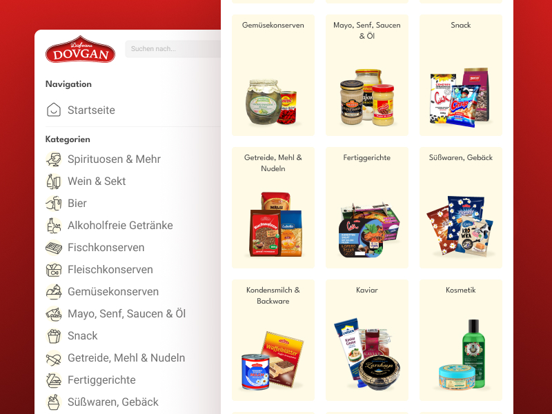
04 — Interface
Desktop & mobile.
Every delivered screen.
Final screens from the delivered deck. No prototype phase existed — this was a tight, decision-driven design sprint. Desktop hierarchy first, then an adapted mobile view for the same key moments.
Desktop — 4 screens
Mobile — 4 screens
05 — Outcome & Reflection
Honest about
the trade-offs.
Roughly one month was allocated for the entire design pass — upfront research consumed a large slice. The UI therefore shipped without a classical prototype phase, without full customer journey maps, and without a documented user-flow library. That was a conscious trade-off under deadline pressure.
Category and structure decisions evolved beyond what the first UX study captured. The shipped IA diverged from the earliest plan — an honest side effect of fast iteration with stakeholders and live business constraints.
"Fast iteration with real stakeholders beats a perfect plan you never ship."