Context
Dovgan ran a typical online shop built on a template for a widely used CMS. That is not a problem in itself — until the assortment is anything but generic. The business sells curated, distinctive food products, so a one-size-fits-all storefront undersold the offer.
Behind the shop, Dovgan supplies German retail chains with authentic products under strong brands from Eastern Europe, Poland, Romania, the Adriatic (former Yugoslavia), and the Middle East (Turkey, Lebanon, Morocco, Syria, and more). The digital experience needed to reflect that positioning, not a default catalogue layout.
Problems
- More and more people buy groceries online. Compared with competitors, the shop was not visually or structurally aligned with that expectation.
- Finding favourite products was harder than it should be; the navigation called for a clearer, more elegant structure.
- The assortment and story deserved a bespoke solution — not only a reskin of a generic template.
Direction
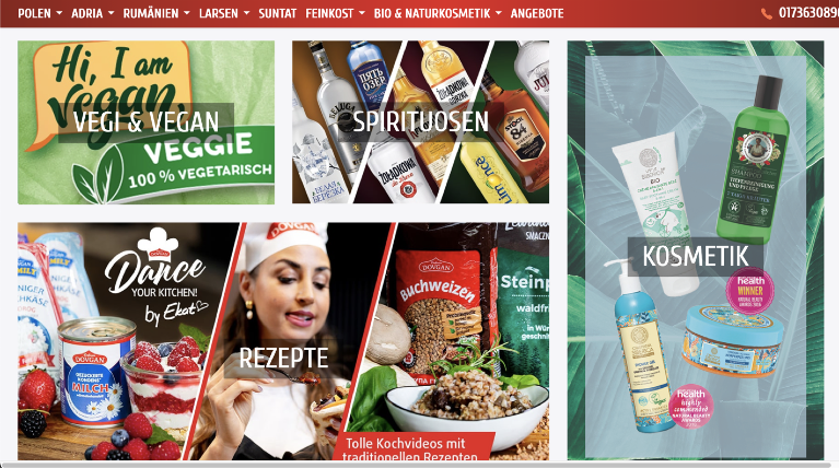
The business was repositioned with food-delivery leaders in mind — players such as Flink, Gorillas, Rewe, and similar services — not as a literal copy, but as a benchmark for clarity, hierarchy, and “grocery on the web” patterns users already understand.
Planned solutions
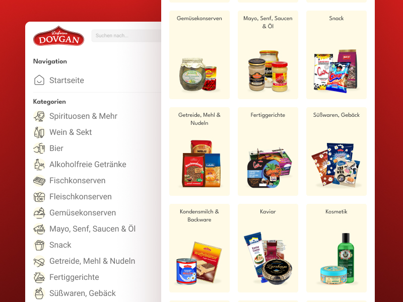
- Organise categories by product type, not by country of origin.
- Optimise key screens for clearer navigation and orientation.
- Define the target audience explicitly and shape the visual and UX language around it.
What was done
- Competitor landscape review and analysis.
- Conversations and interviews with management, marketing, and IT.
- Quantitative UX research with existing customers (see below).
- Synthesis of findings and translation into UI work.
Stakeholder reality: the owner preferred not to work through long checklists and forms. The process relied on trust and direct dialogue rather than heavyweight governance paperwork — which sped decisions up and also meant documentation stayed lean.
Quantitative UX research
Time was tight. With marketing’s help, 20 randomly selected buyers from the existing shop were invited to a short survey — only people who agreed to participate.
Concept test
Single key question: Is it worth reshaping the shop toward an online grocery–style experience and simplifying checkout?
Yes — a new kind of online shop is needed.
Hard to answer.
No — I don’t have a problem with the current shop.
Card sorting (category model)
Marketing proposed a new categorisation. Respondents chose between two schemes (two cards per category).
Categories by product type (e.g. cheese, preserves).
Grouping by country (e.g. Russian, Polish, …).
Outcome & reflection
There was very little room for deep analysis: roughly one month was allocated for the whole design pass. Upfront conversations and research consumed a large slice of that window.
The UI work therefore shipped without a classical prototype phase — no full click-dummy, no formal customer journey maps, no documented user-flow library. That was a conscious trade-off under deadline pressure.
Along the way, several important category and structure decisions evolved beyond what the first UX study had captured. The shipped information architecture therefore diverged from the earliest plan — a honest side effect of fast iteration with stakeholders and live business constraints.
Interface
Desktop and mobile screens from the final deck. Thumbnails below — click any frame to view it full size in the lightbox (arrow keys to step).