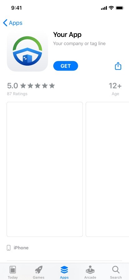
Design-ready for investment. Identity, 10-slide deck, and mobile MVP UI are packaged; engineering paused after the investor reshuffled their portfolio — the work still supports new rounds.
The problem in one beat
Replace opaque KSK habit with a digital owners association: money, votes, and building comms in one legible mobile layer — not a binder in the basement.
Brand identity
Logo and palette were nailed before the app chrome: an isometric cube — blue mass for trust, green lift for growth, window read as “home / unit”. It had to survive favicon size, deck headers, and app bars without losing the 3D read.
A separate brand PDF explored directions that didn’t ship; the approved SVG became the spine for both the investor story and the UI.
- Deep blue
- Sky accent
- Growth green
Unused directions — snapshot
Six of thirteen explorations — click-through set with the production mark lives in the gallery below.
Investor deck & how we worked
10-slide arc
Market tension → product promise → resident capabilities → proof → economics → tech & security → close. Written so the founder could present, not read bullet soup.
Lean & hypothetical
No paid research budget: every frame was a hypothesis to validate post-seed — what to teach before signup, how little PII to collect, how “transparency” looks as a chart.
Deliverables
Brand system, hi-fi mobile flows, investor deck, print-ready marketing layouts — one visual language end to end.
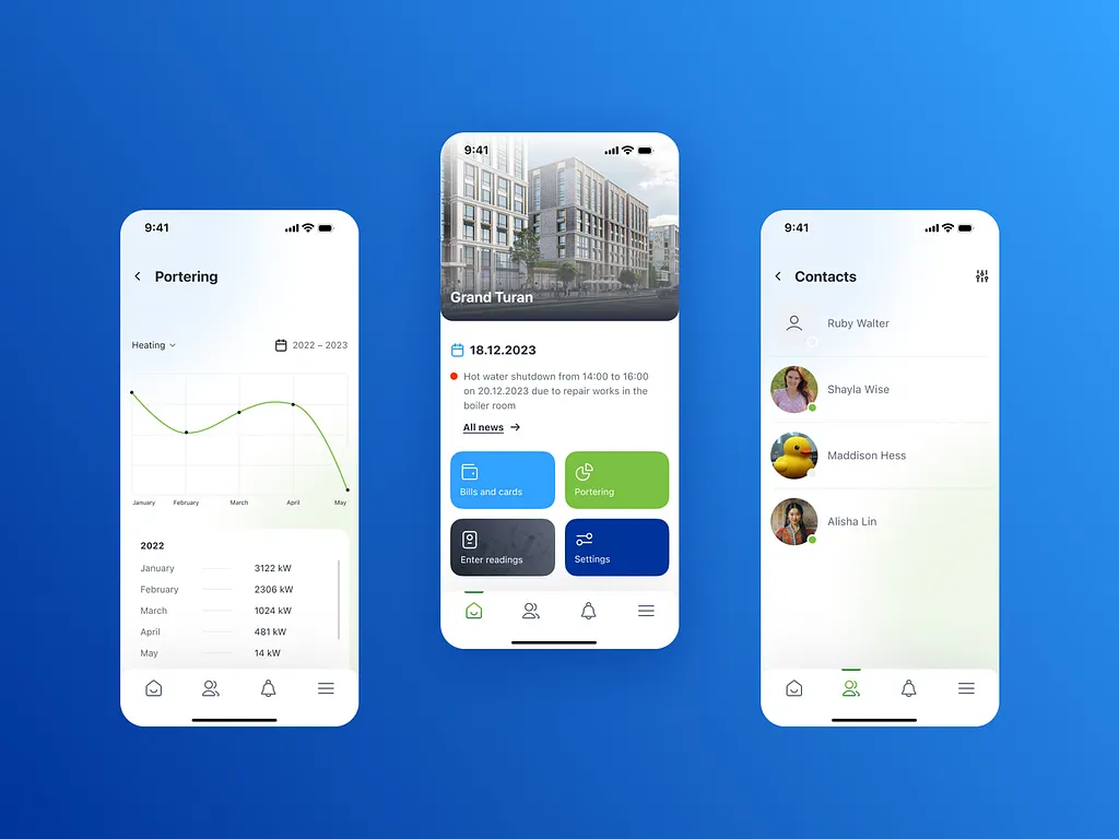
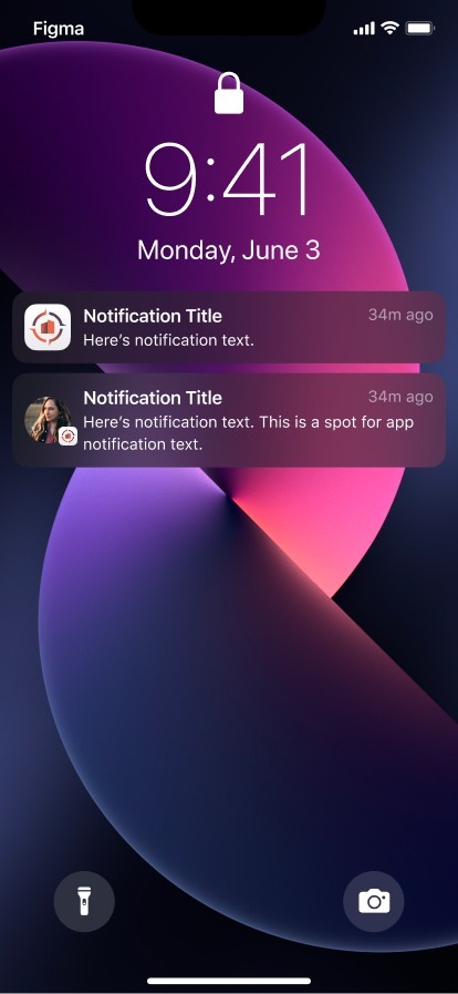
Mobile product
Journey maps carried sticky notes: e.g. how verification might work and where copy must calm privacy fears — not hand-waved for “later”.
Democratic voting
Ballots that feel final and simple — not scanned paperwork dressed as pixels.
Transparency
Utilities and money visualised with real chart patterns so variance is obvious, not buzzworded in the deck only.
Action-first feed
Building notices and neighbour signal in one stream, structured to cut noise.
Onboarding/auth map → four hi-fi onboarding screens. Main IA map → home, contacts, notifications, consumption.
Outcome
Seed funding landed; development stopped when the backer changed strategy. The founder still reuses this pack for new investors — turnkey design position, not a concept deck alone.
Gallery
Deck + full logo set first, then the product thread (maps → onboarding → UI). Thumbnails open in the lightbox; arrow keys follow page order.
Pitch deck & brand identity
The presentation and the mark were developed as one story for investors. The approved logo (SVG) sits with alternate directions exported from the working brand PDF — options the team did not ship.
Investment deck
Logo — approved & unused directions
Full sheet with all explorations: OSI-App-Brand.pdf (working file).
Application — maps, onboarding & UI
Everything here is one product line: the onboarding / auth map informed the mobile onboarding sequence; the main IA map lines up with home, contacts, notifications, and consumption. Screens are shown in that order.