Bestattungen Neumann · Funeral home · Website redesign · 2026
Bestattungen
Neumann
I built the website for Bestattungen Neumann in 2022 at ttmedia, with Elementor. In 2024 someone else reworked it. After ttmedia closed, the client came to Qbus and I became his designer again. I designed a new site for him and compared all three versions with the same attention analysis.
01 Background
History of the project
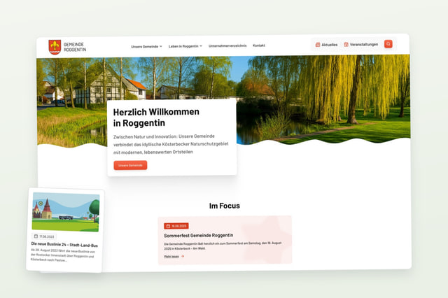
In 2022 I worked at ttmedia and designed a website for Bestattungen Neumann, a funeral home in Mecklenburg-Vorpommern with locations in Güstrow, Schwaan, Bützow, Krakow am See and Laage. I built it with Elementor.
In 2024 someone else reworked the website. ttmedia later closed, the client moved to Qbus, and I got him back as a client. The 2024 version was the starting point for the redesign.
02 Three versions
Three versions of the homepage
2022 is my first design. 2024 is the reworked version that is online now. 2026 is the new design. A click opens the full page.
03 Analysis
Attention analysis of the three versions
I ran all three homepages through Attention Insight, which predicts where people look in the first seconds. The result is closer than I expected.
- Clarity score: 66 in 2022, 64 in 2024, 64 in the redesign. All three are in the optimal range, so the redesign did not improve this number.
- Buttons: in 2022 both main buttons were below the tool's average of 2.4% (0.6% and 1.5%). In 2024 they get 4.0% and 3.4%. In the redesign the two hero buttons get 3.8% and 4.1%. A secondary button below the hero gets 1.4%.
- Contrast: this is where the versions differ. The 2024 map has wide red and orange bands across most of the page. The redesign is mostly green, with red only on the hero photo.
Clarity score of the redesign. 2024: 64, 2022: 66
Attention on the stronger hero button in the redesign. 2024: 4.0%
Attention on the weakest main button in 2022. Both main buttons were below the 2.4% average
Attention maps
04 Redesign
The new design
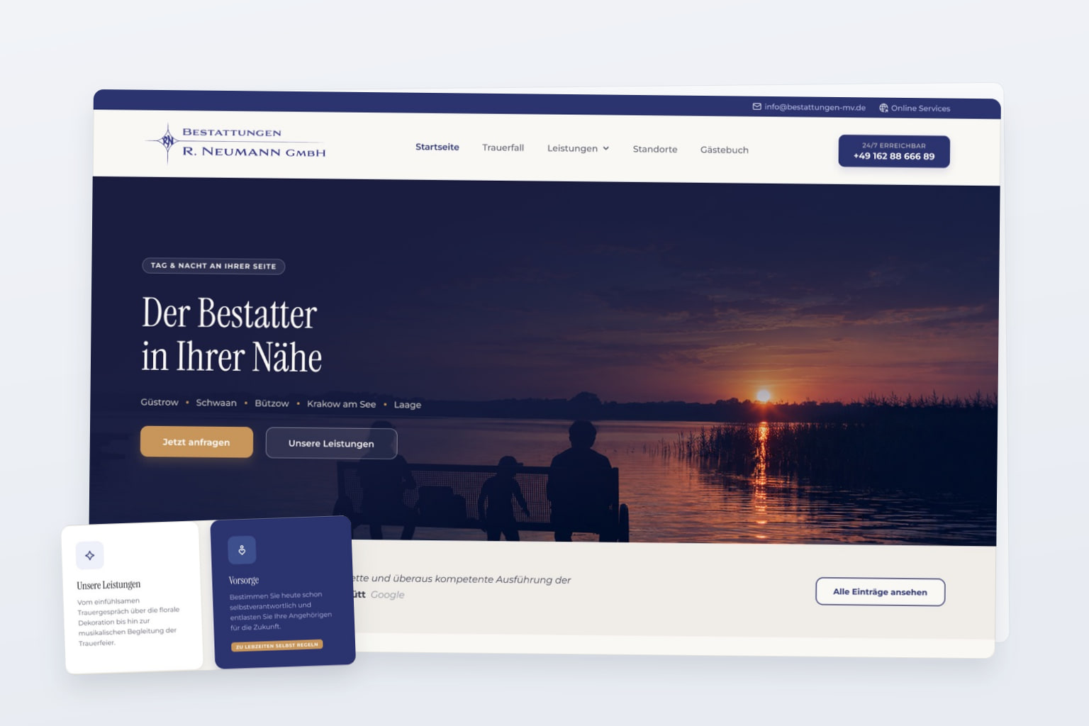
The new site uses dark blue and gold, a serif font for headings and a photo of a lake at sunset in the hero. The hero says what the company does (Der Bestatter in Ihrer Nähe), lists the five locations and has two buttons: request now, and our services. The phone number is in the header, marked as available around the clock.
Below the hero are a quote from a customer review, a text about the first steps after a death, four service cards, the owner's portrait with a quote, and the guestbook.
05 Contrast
Contrast maps, 2024 and redesign
On the left is the contrast map of the 2024 site, on the right the one of the redesign. Red and orange mark zones with low contrast. A click enlarges a map.
06 Result
Result
By the numbers, the redesign is close to the current site: the same clarity score and similar button attention. It is clearly better on contrast. The tool does not measure how a funeral home should look, and that is what changed most: new colours, type and photography instead of the 2024 peach bands. The proposal is with the client.