B2B Booking Portal · Travel Distribution · AI-Assisted Prototyping Workflow · 2026
Book and manage,
in one system.
Sole Product Designer for a B2B portal where travel agencies search, book and manage trips. I rebuilt the path from design to sign-off through an AI-assisted workflow: a dedicated Figma library became clickable HTML via MCP, at roughly 90 % design fidelity — operable exactly where a static Figma hits its limits. B2B system for a tour operator (NDA).
01 Context
One portal for
the whole sales channel.
A tour operator wanted to bring its travel-agency distribution onto its own B2B platform. Through the portal, agencies search trips, book cabins and allotments, cancel, rebook, and grant discounts and vouchers. Two core areas carry the system: trip search – find and book – and management – steering bookings, customers and invoices.
System map
When I joined, an initial design style had already been set up and signed off by the client. It was to be preserved. So my task didn’t start at “how does it look”, but at “how does this become a robust, consistent system – and how does it reach the client fast enough”.
02 Problem
Static screens
prove nothing.
It starts with rough sketches: a quick paper wireframe of the trip search with navigation and a first price matrix. Good enough to clarify the structure – but no proof that the system holds up in daily use.
The path from concept to signed-off design then ran through static Figma screens and long review rounds. With changes coming in continuously, it threatened to stretch across months.
And the decisive part couldn’t be checked in Figma at all: table logic, filters, pop-ups, side panels sliding in and out, the interplay of states, the calm of the transitions. Yet that is exactly what decides whether a booking interface holds up day to day – not a pretty still frame.
03 Role & Process
Many ideas,
one direction.
Sole designer, responsible for the entire path from concept to handoff. I turned the existing style into a real component system, built the prototyping workflow, and coordinated the iterations with project management, engineering and the client.
Ideas came from all directions – from me, project management, the client, and engineering adapting things from a technical angle. Bringing them together, weighing them, and directing them into one consistent solution was my part.
“Six years of IT infrastructure pay off directly here: I don’t build a prototype engineering has to throw away, but one that stands on real frontend code.”
04 Design System
The system first,
then the speed.
The existing style was a start, but not a foundation. So I took it apart and turned it into a real library: colour and text tokens, a type scale, spacing and radii – and components in every state. Buttons with hover, active, focus and disabled; input fields with focus, error and success states; plus tabs, tags, switches, avatars and charts. All documented as a dedicated library file and declared the single source of truth.
This wasn’t for its own sake. Only a cleanly structured system can be processed reliably – by hand and by machine. This library became the basis for everything that followed: it was the precondition for the AI workflow to deliver consistent results in the next step at all.
05 AI Workflow
Don’t draw the prototype,
build it.
The real lever: I connected the Figma components to the library via MCP and generated clickable HTML from it – around 90 % design fidelity, but genuinely operable. That made it possible to check what Figma only claims: pop-ups, sliding side panels, filters, table behaviour, transitions.
From design to sign-off
Before
- Paper sketch
- Static Figma screens
- Review round
- Changes
- Review round again
Weeks per iteration
Now
- Figma library
- MCP
- Clickable HTML
- Checking agent
- Client tests it
Days per iteration
~90 % design fidelity in the generated prototype. The remaining part is checked and corrected by hand.
The first attempt held – so I showed it to project management: fast, testable, convincing. We adopted the approach. From there it ran in rhythm: test a hypothesis on the live prototype, hand it to engineering, send it to the client, fold in feedback. Weeks became days.
Important: no “prompt and pray”. I defined rules and built a checking agent that catches deviations from the style. The AI still made mistakes – small ones, a forgotten spacing, a font size not replaced. The framework caught the gross errors; the rest I corrected under control. The difference isn’t in the prompting, but in the system underneath and the control on top.
“The prototype wasn’t a picture of the product. It was a first, operable version of it.”
06 Decisions
The right number
first.
Trip search: the price matrix
A travel agency decides on cabin category and price in a single glance. So a price matrix that sets cabin category against fare – the relevant information first, not buried in detail views. Availability, best price and price trend sit right in the row; vouchers and discounts were added on the client’s request, cleanly integrated into the booking flow instead of bolted on.
Management: commission up front
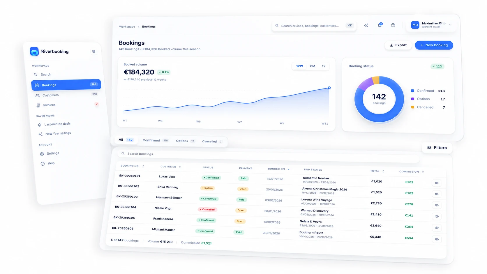
In management, one number matters most to the agency: its own commission. I pulled it up front – not three clicks deep, but right in the overview, next to status and payment. Above it, a compact analytics layer: booking volume, commission and booking status as a chart. What the user needs most urgently for business belongs first. I worked out and defended this prioritisation with the client.
One behaviour for every area
Search, bookings, customers and invoices share the same table logic, the same filters, the same visual style. Whoever masters one area understands the next immediately – consistency that comes from the shared system, not from duplicated work.
07 Interface
One system,
many areas.
Selected screens from the clickable prototype. White-label, all data fictitious.
08 Result
At the client in days,
not months.
Both core areas – search and management – were rebuilt from scratch. The client tested the clickable prototype, signed it off, and commissioned development: budget approved, contract signed, implementation starting in autumn. The AI-assisted prototyping approach was adopted internally as a method. Instead of months in Figma, in a good month – alongside other work – there stood an operable state validated with the client.
“The client’s feedback: this is exactly how the portal should feel.” — Project lead, client side
09 Reflection
Honest about
the limits.
Testing happened with the client, not with the end users – no travel-agency user test, no formal metrics. And an AI workflow is no autopilot: it needs a clean system underneath, clear rules on top, and someone who checks.
The strength of this project isn’t in a magic trick, but in the craft – a reproducible path that turns design into an operable, client-validated state within days. That the method lived on in the team afterwards is the most solid signal this context allows.
“Not prompt faster – direct better.”