PropTech · Kazakhstan · 2024
Open
OSI
Modernising property governance for Kazakhstan: a mobile-first OSI platform, investor pitch, and brand system — designed to replace opaque legacy KSK practice with transparent, democratic tooling residents actually want to open.
01 — Problem
Replace the binder
in the basement.
Kazakh apartment blocks are managed through KSK — an opaque, paper-heavy system where residents have near-zero visibility into how their building funds are spent or decisions made. OpenOSI's mission: replace it with a transparent digital layer that felt civic-grade, not corporate-generic.
"Money, votes, and building comms in one legible mobile layer — not a binder in the basement."
02 — Brand Identity
Logo first,
then the chrome.
Identity was finalised before the app chrome: an isometric cube — deep blue for trust, green for growth, a window read as "home/unit." It had to hold at favicon size, deck headers, and app bars without losing the 3D read.
Thirteen brand explorations were produced; one mark was approved and became the visual spine for both the investor deck and the UI system. All directions are below.
Brand explorations — all 13 directions
03 — Investor Deck
10 slides.
One clear arc.
Market tension → product promise → resident capabilities → proof → economics → tech & security → close. Written so the founder could present, not read bullet soup. Seed funding was secured.
All 10 slides
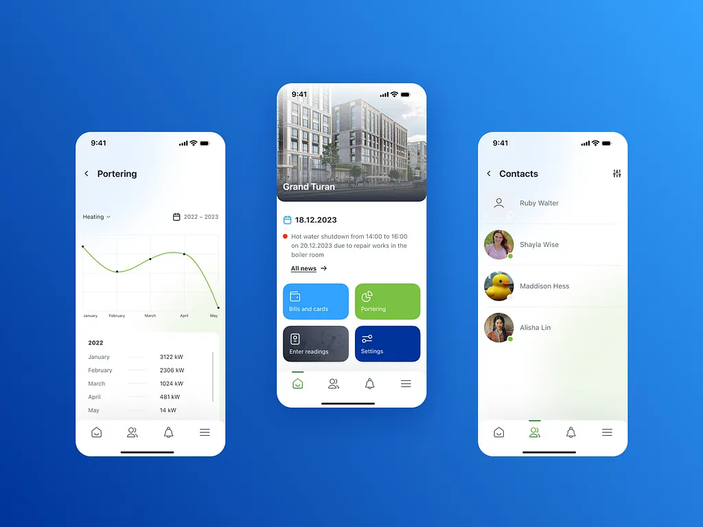
04 — Mobile Product
Maps first,
pixels second.
Journey maps covered onboarding, auth, and IA before any screen was drawn. The app focused on three pillars: democratic voting, transparent utility/finance visuals, and an action-first feed for notices and decisions.
"Journey maps carried sticky notes: how verification might work and where copy must calm privacy fears — not hand-waved for later."
Journey maps
Onboarding — 4 screens
Hi-fi app UI — 4 screens
05 — Outcome
Turnkey design
position, not a concept.
Seed funding landed. Development stopped when the backer changed strategy. The founder still reuses this full package for new investor conversations — brand, deck, and mobile UI remain production-ready assets.
"The founder still reuses this pack for new investors — turnkey design position, not a concept deck alone."