Prepaid Management · B2B · Cruise Operations · 2026
Prepaid Management
for the Fleet
Sole Product Designer – from a 200-column spreadsheet to a web interface the crew on board can use without training. B2B system for a major European cruise line (NDA).
01 Context
A complex system
behind every cruise.
A major European cruise line manages large volumes of pre-booked onboard services for every cruise – spa, restaurants, excursions, onboard credit. Before the cruise, the company sets a revenue forecast. During the cruise, actuals keep drifting from plan: guests show up, cancel, rebook. In parallel, a sales target for add-on services runs alongside, and its progress has to stay readable at all times.
Two views, one source of truth
- Revenue forecast, set before the cruise
- Actuals: guests show up, cancel, rebook
Schematic of the problem, not client data.
Two user groups work in the system: crew on board only see their own cruise and their own area; shoreside managers see the whole fleet, steer across cruises, and pull reports.
02 Problem
What had
to change.
Until then, everything ran on spreadsheets with roughly 200 columns, spread across multiple systems – with no shared source of truth.
03 Role & Process
Solely responsible –
from stack to prototype.
Sole designer with full ownership of UX, UI, and design system. Starting point: a roughly built demo from engineering (functional, no design quality) and Balsamiq wireframes from a developer who had an idea for the main dashboard but couldn't turn it into Figma.
- Worked without direct user access. No contact with power users – instead, precise written table requirements plus close coordination with project management and engineering.
- Analysed the stack before drawing anything. Understood the frontend framework and its constraints before the first screen existed.
- Built foundations and exported them to CSS. Typography, colour, spacing, radii – documented, then turned into a component set and a UI kit as the shared source of truth.
- Played through edge and corner cases. With project management and engineering: e.g. multi-select with simultaneous status changes, conflicting states.
- Designed every scenario, state, and pop-up. Added a bottom summary bar that didn't exist before.
- Interactive Figma prototypes. Sign-off after client review, then one iteration round on tables and fields.
"Six years of IT infrastructure pay off directly here: I speak engineering's language and don't design anything that can't be built."
04 Design System
Stack first,
screens second.
The fast path would have been to make the existing concept ideas "look nice" in Figma. But the build ran on a specific frontend framework with its own grid and its own component constraints. So the stack came first: constraints analysed, then a token structure built along the framework, exported to CSS, and a component kit created as the single source of truth.
The effect: the design survives handoff. Engineering builds faster, the interface stays consistent, and nothing ends in "that can't be built like that."
05 Decisions
Density you
can actually use.
From spreadsheet to default view
Before
- ~200 columns
- several systems
- reconciled by hand
No shared source of truth
Now
- decisive columns by default
- the rest via filters and column controls
- summary bar always visible
All ~200 fields still available
The ten statuses behind daily work
- Pending
- Active
- In Progress
- Completed
- Absent
- Voided
- Reimbursed
- Reversed
- Deferred
- Config Error
200 fields – only the essentials visible
All roughly 200 fields had to stay available – showing everything at once would have produced the same unusable wall of data. So only the decisive columns show by default; everything else can be switched on via filters and column controls when needed. The default view is scannable in seconds, without power users losing a single field.
The status system as the core of daily use
Nearly all daily work consists of status changes – Pending, Active, Completed, In Progress, Absent, Voided, Reimbursed, Reversed, Deferred, Config Error. Order, colour, and clarity decide speed and error rate. Status priority was worked out, colour-coded, display variants tested with engineering, and the critical interactions were handled cleanly. A bottom summary bar was added to keep the key numbers – unreconciled, pending approval, target vs. actual – visible at all times.
Multi-select with simultaneous status changes
An edge case from working closely with engineering: when multiple rows with different statuses are selected at once, the sidebar shows each affected status group individually with a count – instead of one ambiguous combined state. Only unambiguously valid target statuses stay selectable; everything else is visibly disabled.
06 Interface
Every screen,
one source of truth.
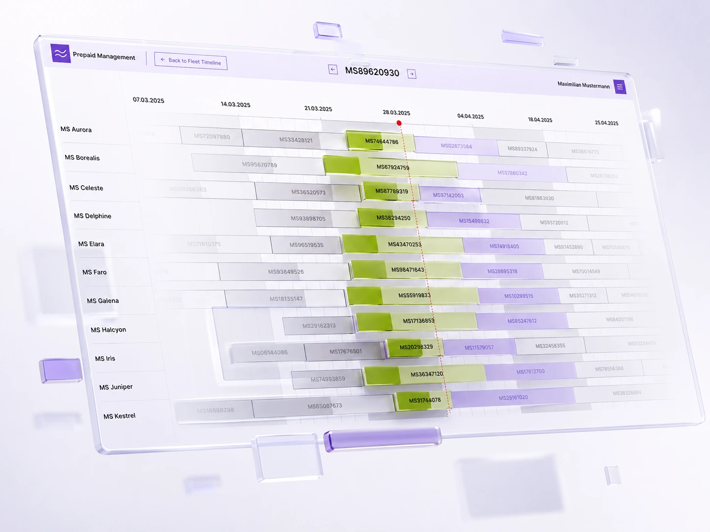
Selected screens from the delivered system. White-labelled, client data replaced.
07 Outcome
Zero-training
in live operation.
The crew used the system without any onboarding – confirmed directly by users. On a ship, every minute of staff time counts; that was the relevant metric here. The client commissioned follow-up iterations on tables and fields, the system is now live on several ships, and it's connected to the onboard billing system for export and reporting.
"Feedback from ship management: clearly structured, easy to use day to day, noticeably less friction in daily reconciliation." — Chief Purser, pilot ship
08 Reflection
Honest about
the limits.
No direct access to end users: the work relied on written requirements and close coordination with project management and engineering, not classic user research. And no formal metrics were collected.
The project's strength lies elsewhere: in the care taken with edge cases and the close partnership with engineering. That the crew was productive within a minute of first opening the system, with zero training, is the strongest signal this context can offer.
"A system that can be operated without explanation is the most honest usability test there is."