Adler Apotheke · Pharmacy · Website concept and design · 2026
Adler
Apotheke
Adler Apotheke is a pharmacy in Rostock. The old website was hard to understand, so we started from scratch: first the structure and the content, then the design. I presented two design variants and the client chose the final one.
01 Background
The pharmacy and the old website
Adler Apotheke is a pharmacy in Rostock. Its focus areas are supplying care homes, parents and children, haemophilia, cannabis, and HIV therapy including PrEP. It also offers vaccinations, medication checks, paternity tests and a customer card.
The old website was hard to understand. We did not rework it. We started with a new concept: first the structure and the content, then the design.
02 Sitemap
Sitemap and structure
We started with the sitemap. The main menu has Anmeldungen, Schwerpunkte, Service, Über uns and Kontakt, plus an order button. Schwerpunkte, Service and Über uns open submenus. Imprint, privacy policy and accessibility statement are reachable from the footer.
The legend separates menu items that have their own page from items that only open a submenu.
03 Wireframes
Wireframes
Next, a concept strategist and I made wireframes for the homepage, the header and footer, and example subpages: orders, registrations, parents and child, cannabis, paternity test, team and contact.
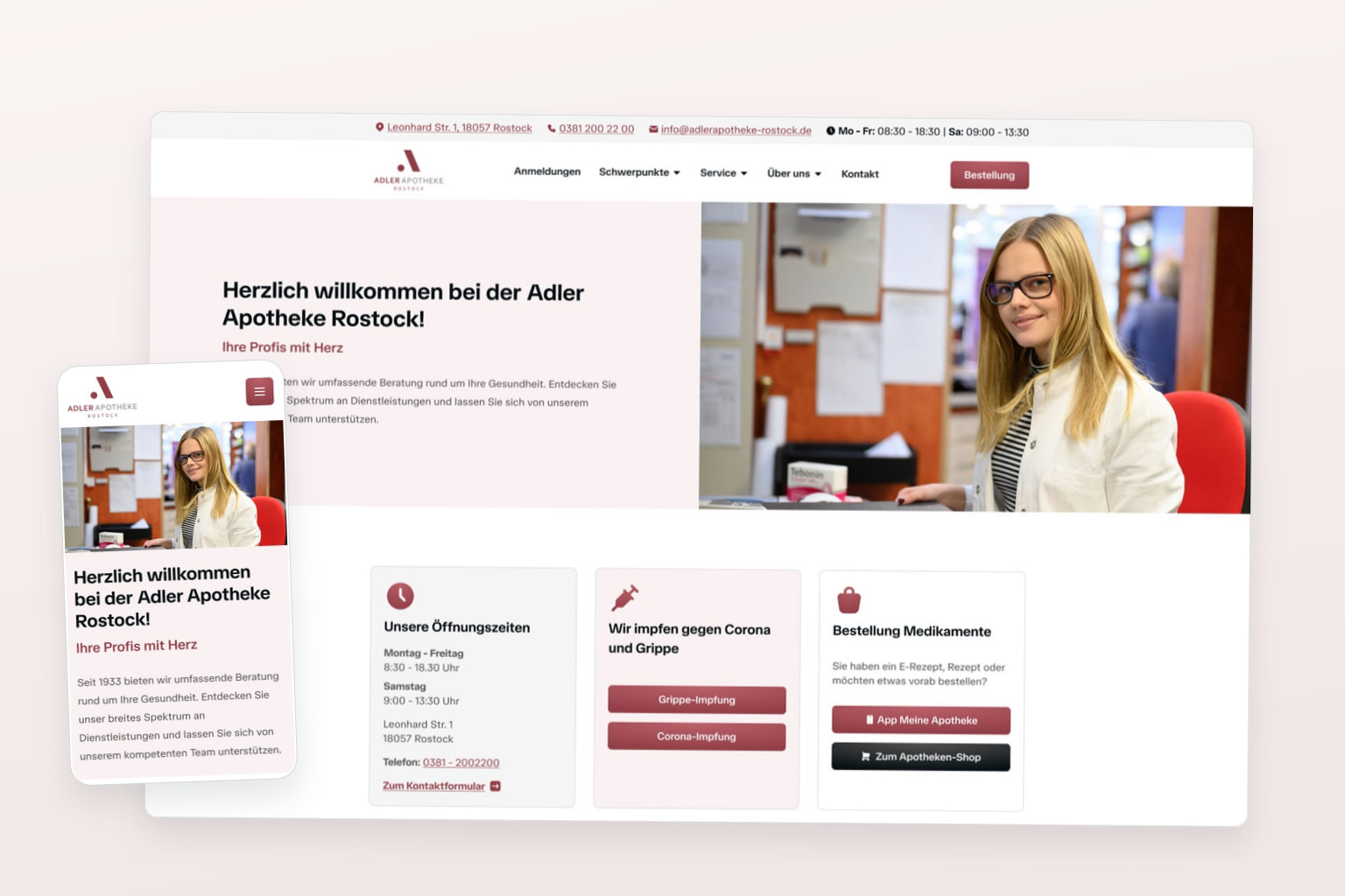
The homepage starts with three cards: opening hours, vaccinations and ordering medication. The header has a contact line, the main menu and the order button. Submenus open on click, not on hover, and the menu turns into a compact sticky bar when scrolling. These rules are written into the wireframes as notes for the developers.
04 Forms
Forms and content blocks
The site needs six forms: contact, paternity test request, customer card registration, Knirps Club registration, internship or apprenticeship request, and job application. All of them have to meet accessibility level AA.
For editing, I added a set of content blocks, for example images in landscape and portrait format, with and without a caption.
05 Design
Design
I presented two design variants. The client chose the final one: a tidy, minimal website in the red of the logo, with the three most common actions on the first screen.
06 Result
Result
The client chose the final design. The sitemap, wireframes, forms and design are done.