ScanHaus Marlow · Prefab homes · Homepage redesign · 2025
ScanHaus
Marlow
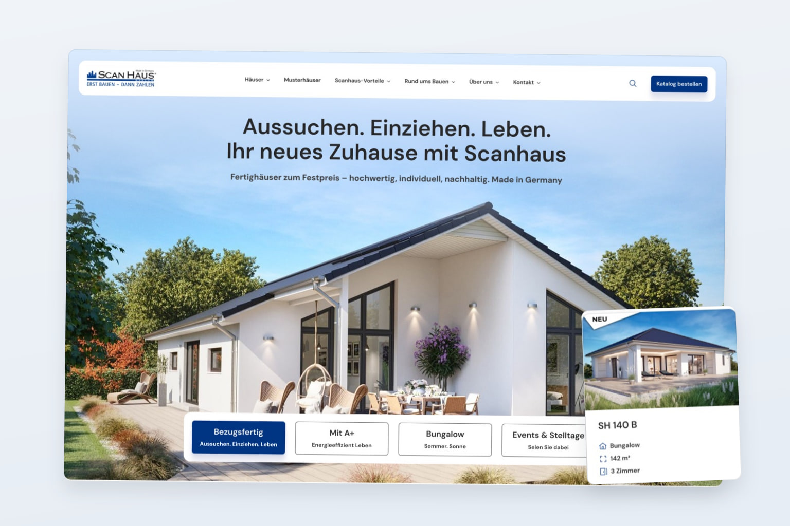
I redesigned the homepage for ScanHaus Marlow, a German prefab home builder. The first screen shows a house and gives visitors a clear way to explore the range or order a catalogue.
01 Background
About the client
ScanHaus Marlow sells prefab homes at a fixed price. The company has more than 30 years of experience and over 50 show homes and sales offices across Germany.
I proposed a simpler homepage to help visitors find suitable house designs faster and order the catalogue.
02 Original site
The original homepage
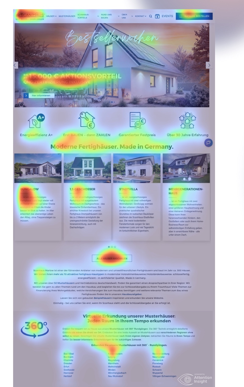
The original homepage opens with a banner advertising a €15,000 discount. Four icons, four house cards, long blocks of text, a 360° section and a list of cities compete for attention. The page gives visitors several possible next steps with no clear priority.
03 Analysis
Attention analysis of the original homepage
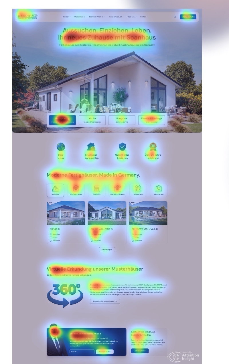
I analysed both versions with Attention Insight. The tool uses eye-tracking data to predict where visitors are likely to look in the first few seconds.
- Clarity score: 70 out of 100, in the optimal range.
- The main button gets 3% of predicted attention.
- The contrast map shows low contrast in parts of the banner text.
- Attention is spread across the banner, the house cards and the city list.
04 New design
The new homepage
The first screen pairs a headline and a house photo with four links for move-in-ready homes, A+ energy efficiency, bungalows and events, including days when visitors can watch a prefab house being assembled. Below that, I grouped the fixed price, the A+ energy rating and over 30 years of experience in one row. Further down, visitors can browse house types, take a 360° tour, find a local adviser and order the catalogue.
Clarity score, up from 70
Predicted attention on the main button, up from 3%
Predicted attention on the catalogue button in the header. The tool’s benchmark is 2.4%.
05 Comparison
Heatmap before and after
I analysed both homepages with the same settings. On the original page, the model predicts that attention is spread across several areas. In the redesign it concentrates around the headline and the four links, then moves down the page. Drag the slider to compare the heatmaps.
06 Result
Result
Predicted attention on the main button rose from 3% to 5.5%, above the tool’s benchmark of 3.4%. The clarity score went from 70 to 72.