Medical travel · Germany · UX/UI redesign
ENANDE
Redesign
Transforming the digital experience for international orthopedic patients — from an overwhelming, low-contrast marketing site to a clear value proposition, visible trust, and a legible journey from consultation to recovery.
01 — Background
Second chance,
first impression.
I originally applied to ENANDE, passed the interviews, but took a different offer. A year and a half later our paths crossed again — they asked me to complete a test assignment for a website redesign. I didn't end up joining the team, but the research and concept work I delivered resulted in a direction I'm genuinely proud of.
"Work that never shipped internally — but it shows exactly how I think."
What ENANDE does
ENANDE is an international case management service that brings American and English-speaking patients to Germany for specialized orthopedic surgeries — spine, hip and knee replacements. The pitch is simple: German healthcare, world-class quality, at a fraction of US prices. For patients whose insurance won't cover these procedures, it's a life-changing option.
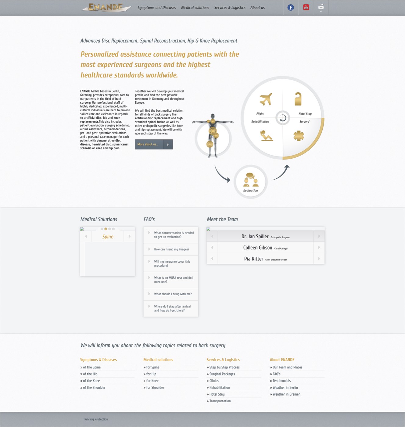
02 — The original site
A wall of text
asking for trust.
Before anything else I archived and audited the live site. What I found was a dense, text-first experience that asked anxious patients — people considering surgery abroad — to work hard before they could understand the product at all.
Full-page scroll — the real first impression
03 — Research & audit
Data behind
the gut feeling.
Three structural problems backed up what the eye already said.
- Clarity score of 46 — classified as “moderate difficulty.” Text-heavy pages with no visual anchors. Users had to read before they could orient.
- Contrast ratios of 2.6 and 4.1 — both below WCAG AA. The site literally failed on readability for a significant share of users.
- No hierarchy for trust signals — experience, success rates, patient stories were buried below the fold inside walls of copy. A scared patient deciding on surgery abroad never gets that far.
Clarity score — original (moderate difficulty)
Worst contrast ratio found (WCAG AA minimum is 4.5)
Trust indicators visible above the fold
Presentation audit slides
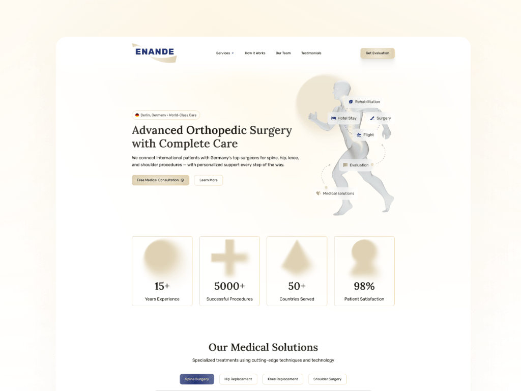
04 — The concept
Trust first,
copy second.
- Hero with immediate proof: 15+ years experience, 5000+ successful procedures, 98% patient satisfaction — visible before any scroll.
- Clarity score lifted to 62 — from moderate difficulty to the optimal band.
- Journey map navigation: Consultation → Travel → Surgery → Recovery. Tabs replace infinite scroll.
- Contrast-clean system: All text/background pairs pass WCAG AA. Nothing is just decorative anymore.
New clarity score — optimal range
Minimum contrast ratio in new system
Trust signals above the fold
Desktop concept
Mobile concept
05 — Side by side
One drag.
Night and day.
06 — Takeaway
The work shows
in the numbers.
The assignment never shipped, but the research and concept are a complete artefact: a documented problem, measurable improvements, and screens that prove the direction. Clarity score +16 points. Contrast issues eliminated. Trust above the fold.
"Sometimes the strongest portfolio pieces are the ones that show how you think — not just what shipped."